As you might have noticed, we've just made a significant change to the style and navigation within CSDatum. This is the first time we've switched things up since the program was launched in 2015. We've been working on these improvements for several months and we're excited to finally unveil them.
Most of us don't like change though - so why did we do it?
Plainly stated, CSDatum is about simplifying the management of your municipal and facility data . That means we're constantly thinking of ways to save you time, money and stress - and these updates are no exception.
So the best way to see what we're talking about is, well, just start clicking around....but here's a quick explanation of the key changes:
After you log in (on a desktop or larger tablet) - you'll see a screen like this.
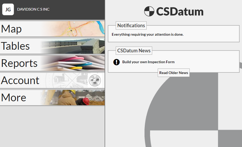
Everything here should be self-explanatory but notice that small white button in the upper left corner with my initials? Click on that button to see the following information or actions.
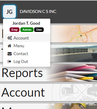
This button will be visible in many locations - so use it to quickly jump around, log out or contact one of us.
This is probably the best part of the update - as an abbreviated version of the menu shown above will always at your fingertips!
Simply click on the menu icon near the word CSDatum (this is true on the map, table or just about any page):
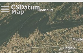
So with one click (and without reloading a page) - a full menu of options will appear.
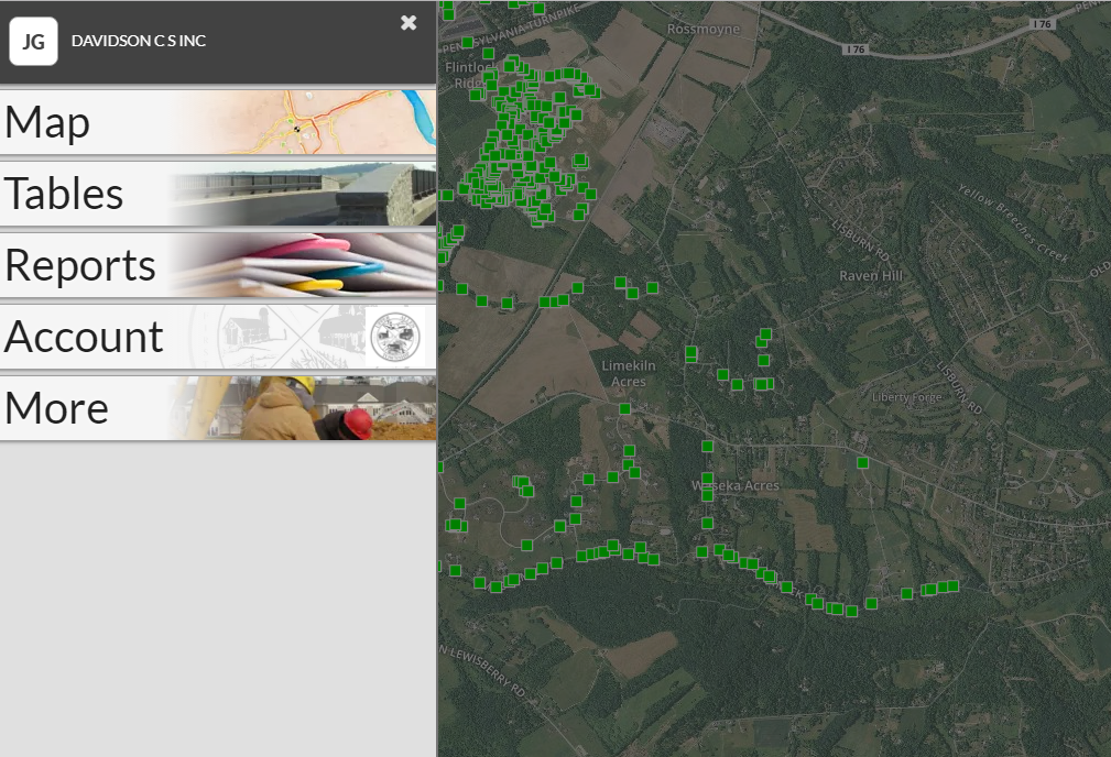
Simply click on the X or click off the menu to close.
Also, if you're on the map and open the menu - the 'Tables' section will be expanded and focused on the asset you're working on.
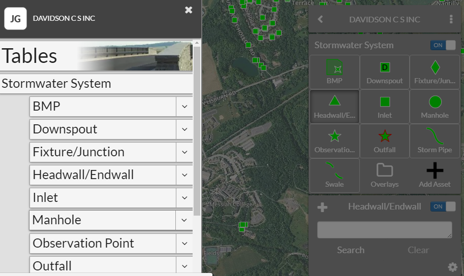
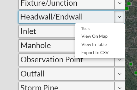
Clicking on the asset name (in this case, Headwall/Endwall) will open the data in Table view - but you also have some other options at your fingertips. Simply click on the drop-down arrow to see this screen:
That's it for now and there are many other subtle improvements for you to discover in the program. As always, we'd love to hear from you after you click around check things out!